| | [RESULTS UP!!!!] ASSIGNMENT 5 ~Paint~ |  |
|
+6Isisaur ElizabethBianchi DiorSim Bubbles1419 Voïces Elasticgirl 10 posters |
|
| Author | Message |
|---|
Elasticgirl
Admin
Posts : 533
Points : 347179
Reputation : 4
Join date : 2012-07-20
Age : 27
Location : Over the rainbow
| | Subject: [RESULTS UP!!!!] ASSIGNMENT 5 ~Paint~ Wed Sep 26, 2012 9:41 pm | |
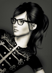
| [You must be registered and logged in to see this link.]It’s paint for this assignment! In this assignment, the girls are modeling with paint. There are only 8 of you left and now we are stepping up the game even more!
Each girl must create a headshot OR body shot of their model splatter painted. You must create a “nude” perspective (you can put a bandeau bathing suit top and bottom on your model) which basically means she cannot be wearing clothing BUT must have paint splattered artfully to give the illusion that she is nude. Please look at Ella.Kirk’s photo as an example. If you have any questions, please feel free to ask me ASAP.
REQUIREMENTS:
~ One Headshot OR body shot
~ Splatter paint the photo
~ Must give the illusion that your model is not wearing clothing but the paint so-to-speak “covers parts of her” like her breasts
This assignment is due: Friday, October 5th, 2012, 12 AM Hawaii Time
EXAMPLE PHOTOS
By Ella.Kirk (this photo was included in her application to this competition):
- Spoiler:
[You must be registered and logged in to see this image.]
By Nicolla:
- Spoiler:
[You must be registered and logged in to see this link.]
America’s Next Top Model examples:
- Spoiler:
[You must be registered and logged in to see this image.]
THE SCORES:
Without further ado, here are the comments in no particular order…
Bao:
- Spoiler:
Elasticgirl Comments: I do not think this is your best photo. I feel like you started out really strong and then slowly it’s like you lost your little “umph” that separated you and made you better than the others. I like the pose and the hair. BUT the paint splatters are a little off. Honestly, the paint doesn’t look like it’s on her and it looks really flat. In addition, there is this dark black thick line in the bottom left corner under the green paint—ummm it looks really weird and doesn’t fit in…IDK if this is just my screen picking it up or if you weren’t aware of it but that wasn’t that good. So overall, this photo lacks dimension and a high fashion sense. I am a little disappointed in you Bao, I was hoping you would be at least in the top 2. Please pick up your UMPH again and I am sure you will rock it!
Brook’s Comments: First thing is that I hate that paint, it looks too fake I think you should’ve blended it more into your sim with shadows and highlights to make it look like its actually part of the picture and not just blobbed there. But I do love Bao’s fierce expression in this and it really shows her strength. I don’t think you could've done better on this, this assignment was to show your creative side, I didn't think this was at all...
Jasmine:
- Spoiler:
Elasticgirl Comments: I love it! I love how the pose is very playful and in ACTION which fits with the paint! I also really like the paint—I think you did an excellent job on making the paint look like it’s like a cloak covering her body which is dripping off behind her as she speeds ahead. I also like the rich colors. Unfortunately I do not think this is high fashion. For example, the hair is very normal and not high fashion—this looks more like a campaign ad for maybe a skin lotion that moisturizes the skin. In addition, I do not see any high fashion in the pose. To make it more high-fashiony, you could’ve made her face contort into a smize and had her face facing the camera. Man, if Jasmine would’ve made eye contact with the camera, she would be best photo of the week! Keep up the amazing work!!
Brook’s Comments: I really love this, the way the paint splatters wrap around her body to give her some modesty and her legs. Buuuuuuuut the paint splatters on the tops her legs look a bit fake compared to the splatters around her body and her lower legs and feet, the leg behind her looks a bit borked and stretched. The background looks great and the white splatters contrast really well against her tanned skin and the black background. I think her pose looks a bit ‘fairy-like’ and the splatters look like wings and I really like that look. I think you have done really well!
Gladice:
- Spoiler:
Elasticgirl Comments: Your model is stunning! I love her pose, hair, and facial expression—it is SUPER SUPER high fashion! I also like the glow on her earrings and the way her eyes literally glow and pop in this photo! BUT the huge thing that turned me off of this photo is the paint. Girl, you did NOT get this assignment it looks like. For example, the paint is badly edited in. There is no dimension to it and it really just looks like you took the paint brush and slabbed some colors across her collarbones and down her neck. I really wish you had more dimension to the paint or it bubbled on her skin or something like that so it wasn’t this flat. Gladice, I know you got so much in you and I WANT TO SEE IT! Keep up your good work and I am sure you will make it all the way to the top. There is no doubt about that.
Brook Comments: WOW!! Gladice looks absolutely gorgeous! Your paint splatters are perfect, they blend really well into her skin, giving an affect of them drying a little and not just blobbed there, Gladice’s hair stands out against her skin and the dark background automatically drawing the attention to Gladice. The only small thing I dislike about this is her eyes, they look really spooky and she kind of looks a bit possessed O_O
I love how you added some accessories that takes the plainness off of the picture, I really like Gladice’s expression is really brings out her luscious lips. Your image happens to be one of my favourites in this assignment!
Imogen:
- Spoiler:
Elasticgirl Comments: Holy S%&*! This is my favorite photo in the world! First, you get such DIMENSION in your paint splattered on your model that it literally looks like she is chipping into pieces! Second, the pose is perfect as it shows so much emotion and movement. Third, you utilized her hair color PERFECTLY as it complements and balances out the colors of paint splashed on her. You know, it actually looks like your model’s hair IS paint because it looks like it falls down her shoulder like the green paint dripping down her leg. Fourth, the detail in the paint is AMAZING and I absolutely love how you took your time to make the little specks of paint flitting off. And fifth, the background is perfect—you actually went beyond the common black background and chose something like graffiti (which is usually colorful with the paints on your model but is now black and white) that counteracts the rich colors coming off your model. There is really nothing I can tell you to fix. This is your best photo yet and honestly, I think this is the best photo thus far into the cycle. BRAVO!!!!!!!!!!!!!!!
Brook Comments: Well some of the paint splatters look a bit fake such as the ones on her leg and her arm, but the one covering her chest looks great, but it kinda looks like she has a smushed in boob... the colours of the paints work amazingly well with her hair colour. I love Imogen’s expression, it looks really seductive and sexy, she stands out against the black and white graffiti background, I love that as the background you’ve chosen and not a boring black background that many of the contestants have chosen. I hope to see more great work from you!
Kea:
- Spoiler:
Elasticgirl Comments: Okay, I definitely like the colors and how you incorporated the white easel into the photo. I like the pastel blue background and the brightness of the paints. Overall I think this is a very nice and good photo BUT there are some things that can be improved on. For example, both her hands and face look very awkward. I do not like how her neck is tilted because it looks like she has a cramp there and also the same goes for the rest of her face. I do not like her eyes closed the way they are and think this photo would be so much better with her eyes open. Also I hate to say this, but the hair is HORRIBLY edited. It is blurry, and disproportionate, and just overall messy. CAS hair would’ve been perfect for this photo! And lastly, the arrangement of the paint on her body is weird. I like the splashes of paint but I do not like the large segments (like the green one that is around her waist and arm) because they look absolutely nothing like paint. So like I said, this is a nice photo overall but definitely far from your best.
Brook Comments: I love the fact you have used an in game background, not many people are very good at including their sims into those kind of backgrounds. I don’t really like Kea’s expression, I would’ve liked it better if her eyes were open and her hair looks a bit chunky and messy. The base paint on her body looks great, but I hate how you’ve put fake looking splatters on top of them, it just ruins it to be honest. The way you have included an easel into your image is a great touch and shows what you picture is about, but please those shoes have to go, they are awful!! Keep up the good work!
Elizabeth:
- Spoiler:
Elasticgirl Comments: I like it. I like how you doubled your model. I really like all the creativity in this photo. And I like the paint splatters although they don’t look that dimensional. This really looks like an ad though and I like how you made it pretty high fashion-y. But I feel like this photo is lacking something. Honestly if you wouldn’t have said you are representing her going to prison, then I wouldn’t have understood this—I only would’ve thought this was an ad for some new jewelry or something in a fashion magazine. Also you said you were creating opposite sides of your model but I do not see it other than having different color paints. You could’ve made one side more radical than the other with maybe spiky hair or darker makeup and then make her other side look more like an angel. I don’t know but I think that you should’ve upheld more of what you described the photo to be in the description.
Brook Comments: I love the creativity in your image! The contrast between the black and white looks amazing how you have used white paint on the black side and black on the white side looks really nice. I love how you are the only one who has used only black and white paint into your picture, you have thought out of the box on this. The only things I don’t like on this is Elizabeth’s expression, she looks a little blank and a bit bored, also, I don’t like her lipstick on the left hand side, it probably should’ve been a light colour and not blue it doesn’t look right as there is not colour on this apart from the red stripe going down the middle separating the two colours.
Charlie:
- Spoiler:
Elasticgirl Comments: I like your model overall. I like her pose, although it is a little too sexual for me. I also like the paint but it looks a little dirty and all over the place. For example, I don't like the paint on her elbow. It looks like something really fake and kind of like goey lie just hanging onto her elbow. At least of it were dripping down it would've been cooler. So overall I think it's a Good photo but not the best. I also am not getting much of a high fashion feel from this photo. I think that might be a little from your choice in pose but also the paint colors. Like I said, they are very dull and not appealing to the eye. Keep up your good work and I know you will DEFINITELY do better. I keep saying this for a reason, girl.
Brook Comments: I’m really disappointed in this; this is not one of your best works. To be honest I think it’s one of your worst. I like how you’ve done a posterized version; I think it’s really creative, your paint drawing looks good but it does look a bit thick and chunky, the drips dripping down look a bit chunky too, they should’ve been thinner and more stringy looking. The pose you have used looks borked around Charlie’s arm, I don’t like her expression very much but it does show she is fierce.
Dana:
- Spoiler:
Elasticgirl Comments: I like your pose and how your model looks. I love her eyes but besides that, this is your worst photo yet. I am sorry I have to say this but you have so much talent and you threw ALL of it away with this photo. For example, the hair is nicely edited UNTIL you get to the ends. What happened??? It looks like she took a saw to the ends and chopped them off perfectly straight WHILE they are in motion. Nah-ah not good Bubbles. You have to make her hair continue to flow from the top to the bottom. Otherwise it looks very fake. You also need to create loose ends and fly aways to make it look more realistic!!!! And the last thing that really bothers me is the paint. Yes I understand you choose not to splatter paint at all BUT them you could've at least done a better job with the paint FLYING out of her mouth. I don't like at all the way the paint looks. It looks so weird and out of place in this photo that honestly, it would've looked better without the paint. Seriously. It looks unrealistic as it comes out of her mouth because when you shoot paint out like that it doesn't cover the bottom lip like that. You need to see some of the inside of her mouth like the teeth and tongue to make it more realistic. So overall I am EXTREMELY disappointed in you. I hate to be so blunt and please don't be angry at me but you sucked ass in this photo. You have SOSOSOSOSO much talent and to tell you the honest truth, from the beginning I thought you would be in the top 2. So is this photo going to jeopardize your chance in making it all the way to the top?
Brook Comments: Personally I find this a bit scary... the paint coming out of her mouth honestly freaks me out. I like your hair drawing, but I don’t like how it just stops into a perfect line on her chest it should’ve had a few wispy bits or ended in a point, I can’t hair draw but I know that long hair shouldn’t end in a line like that. The paint colour clashes a bit with Dana’s hair colour and her expression would’ve looked better if her mouth was closed and the paint wasn’t pouring out of it. I think this is quite disappointing compared to your other works.
Without further ado, here is the callout order…
Best photo of the week goes to…
- Spoiler:
Imogen! [You must be registered and logged in to see this image.]Elasticgirl: High fashion 9/10 Model expression 9/10 Relativity to assignment 10/10 Quality 10/10 Overall Appearance 10/10 Model Appearance 9.5/10 Creativity 8.5/10 TOTAL: 65.5/70 High Fashion 10/10 Model Expression 10/10 Relativity to Assignment 10/10 Quality 10/10 Overall Appearance 9/10 Model Appearance `10/10 Creativity 8/10 Total 67/70 TOTAL COMBINED: 137.5/140 (+ 5 points for challenge)
Runner up for best photo is…
- Spoiler:
Jasmine! [You must be registered and logged in to see this image.]Elasticgirl: High fashion 7/10 Model expression 9/10 Relativity to assignment 9.5/10 Quality 9/10 Overall Appearance 9.5/10 Model Appearance 9/10 Creativity 8/10 TOTAL: 61/70 High Fashion 10/10 Model Expression 8/10 Relativity to Assignment 10/10 Quality 9/10 Overall Appearance 10/10 Model Appearance 10/10 Creativity 9/10 Total 66/70 TOTAL COMBINED: 131/140 (+ 4 for Challenge)
The third name I am going to call is…
- Spoiler:
Elizabeth! [You must be registered and logged in to see this image.]Elasticgirl: High fashion 9/10 Model expression 6/10 Relativity to assignment 8.5/10 Quality 9/10 Overall Appearance 7/10 Model Appearance 7/10 Creativity 9/10 TOTAL: 55.5/70 High Fashion 10/10 Model Expression 9/10 Relativity to Assignment 10/10 Quality 10/10 Overall Appearance 10/10 Model Appearance 9/10 Creativity 10/10 Total 68/70 TOTAL COMBINED: 123.5/140
The fourth name I am going to call is…
- Spoiler:
Gladice! [You must be registered and logged in to see this image.]Elasticgirl: High fashion 10/10 Model expression 9/10 Relativity to assignment 7/10 Quality 7/10 Overall Appearance 6/10 Model Appearance 8/10 Creativity 6/10 TOTAL: 53/70 High Fashion 10/10 Model Expression 10/10 Relativity to Assignment 10/10 Quality 10/10 Overall Appearance 10/10 Model Appearance 9/10 Creativity 9/10 Total 68/70 TOTAL COMBINED: 121/140
The fifth name I am going to call is…
- Spoiler:
Kea! [You must be registered and logged in to see this image.]Elasticgirl: High fashion 8.5/10 Model expression 6/10 Relativity to assignment 9/10 Quality 9/10 Overall Appearance 8/10 Model Appearance 7/10 Creativity 8/10 TOTAL: 55.5/70 High Fashion 8/10 Model Expression 7/10 Relativity to Assignment 10/10 Quality 7/10 Overall Appearance 9/10 Model Appearance 8/10 Creativity 9/10 Total 58/70 TOTAL COMBINED: 120.5/140 (+7 points for challenge winner)
The sixth name I am going to call is…
- Spoiler:
Charlie! [You must be registered and logged in to see this image.]Elasticgirl: High fashion 8/10 Model expression 6/10 Relativity to assignment 8/10 Quality 9/10 Overall Appearance 7/10 Model Appearance 7/10 Creativity 8/10 TOTAL: 53/70 High Fashion 9/10 Model Expression 8/10 Relativity to Assignment 10/10 Quality 8/10 Overall Appearance 8/10 Model Appearance 8/10 Creativity 10/10 Total 61/70 TOTAL COMBINED: 114/140
The bottom two are…
- Spoiler:
Bao [You must be registered and logged in to see this image.]You came into this competition so strong, ranking in the top 5 in several assignments. But then you started to waver and become more of the “common,” the “forgetta-girl.” Do you have what it takes to bring you back to the top? Dana [You must be registered and logged in to see this image.]Dana, you came into this competition headstrong. You dominated many assignments and always came up as my favorite. I thought you were going to be in the top 3, at least. But then you started to fall and with that you didn’t follow directions when we told you to not draw hair, for example. You continuously don’t follow these directions and you are no longer impressing us.
So, who stays?
- Spoiler:
Dana!
Congratulations on staying through to the next round. Yes, you haven’t been following directions that much but you have a star quality in you that we cannot disregard. You have the characteristics that every model should have—and you need to stick to your brand and continue being just the way you are, because that will get you through even farther.
Your scores:
Elasticgirl:
High fashion 8/10
Model expression 7.5/10
Relativity to assignment 9/10
Quality 8/10
Overall Appearance 7/10
Model Appearance 8/10
Creativity 7/10
TOTAL: 54/70
Brook:
High Fashion 7/10
Model Expression 7/10
Relativity to Assignment 10/10
Quality 7/10
Overall Appearance 8/10
Model Appearance 8/10
Creativity 7/10
Total 54/70
TOTAL COMBINED: 108.5/140
Bao, we are so disappointed to see you go. You have so much talent and I think you can go a lot farther. But this was just not your time. Please continue working as hard as you do because one day you will be unstoppable and everyone will want to be just like you.
Here are your scores:
Elasticgirl:
High fashion 6/10
Model expression 8.5/10
Relativity to assignment 7.5/10
Quality 7/10
Overall Appearance 6/10
Model Appearance 7/10
Creativity 7/10
TOTAL: 49/70
Brook:
High Fashion 9/10
Model Expression 10/10
Relativity to Assignment 10/10
Quality 7/10
Overall Appearance 7/10
Model Appearance 8/10
Creativity 8/10
Total 59/70
TOTAL: 108/140
Overall Ranking:
- Spoiler:
1. ELIZABETH: 630.5
2. KEA: 598
3. JASMINE: 585
4. IMOGEN: 576
5. DANA: 567
6. GLADICE: 547.5
7. CHARLIE: 538.5
EXTENSIONS:
CHARLIE until Monday, October 8th, 2012
Last edited by Elasticgirl on Sun Oct 07, 2012 10:41 am; edited 11 times in total | |
|
| | |
Elasticgirl
Admin
Posts : 533
Points : 347179
Reputation : 4
Join date : 2012-07-20
Age : 27
Location : Over the rainbow
| | Subject: Re: [RESULTS UP!!!!] ASSIGNMENT 5 ~Paint~ Wed Sep 26, 2012 9:41 pm | |
| | |
|
| | |
Elasticgirl
Admin
Posts : 533
Points : 347179
Reputation : 4
Join date : 2012-07-20
Age : 27
Location : Over the rainbow
| | Subject: Re: [RESULTS UP!!!!] ASSIGNMENT 5 ~Paint~ Wed Sep 26, 2012 9:41 pm | |
| | |
|
| | |
Elasticgirl
Admin
Posts : 533
Points : 347179
Reputation : 4
Join date : 2012-07-20
Age : 27
Location : Over the rainbow
| | Subject: Re: [RESULTS UP!!!!] ASSIGNMENT 5 ~Paint~ Wed Sep 26, 2012 9:41 pm | |
| | |
|
| | |
Voïces

Posts : 91
Points : 344389
Reputation : 0
Join date : 2012-07-31
| | Subject: Re: [RESULTS UP!!!!] ASSIGNMENT 5 ~Paint~ Thu Sep 27, 2012 8:22 am | |
| Mmh, sounds interesting!! | |
|
| | |
Bubbles1419

Posts : 174
Points : 344017
Reputation : 0
Join date : 2012-08-09
Age : 25
| | Subject: Re: [RESULTS UP!!!!] ASSIGNMENT 5 ~Paint~ Fri Sep 28, 2012 10:07 pm | |
| So do we have to do paint splatter, or can we do as shown in ANTM? | |
|
| | |
Elasticgirl
Admin
Posts : 533
Points : 347179
Reputation : 4
Join date : 2012-07-20
Age : 27
Location : Over the rainbow
| | Subject: Re: [RESULTS UP!!!!] ASSIGNMENT 5 ~Paint~ Fri Sep 28, 2012 10:18 pm | |
| I am going to let you do either or. I would say either way is totally fine  | |
|
| | |
Bubbles1419
Posts : 174
Points : 344017
Reputation : 0
Join date : 2012-08-09
Age : 25
| | Subject: Re: [RESULTS UP!!!!] ASSIGNMENT 5 ~Paint~ Fri Sep 28, 2012 10:36 pm | |
| | |
|
| | |
Elasticgirl
Admin
Posts : 533
Points : 347179
Reputation : 4
Join date : 2012-07-20
Age : 27
Location : Over the rainbow
| | Subject: Re: [RESULTS UP!!!!] ASSIGNMENT 5 ~Paint~ Fri Sep 28, 2012 11:11 pm | |
| Hahahaha I love that movie!!!!!! | |
|
| | |
DiorSim
Posts : 193
Points : 344226
Reputation : 0
Join date : 2012-08-08
Location : Germany
| | Subject: Re: [RESULTS UP!!!!] ASSIGNMENT 5 ~Paint~ Sat Sep 29, 2012 7:41 am | |
| This will be a little challenge, but I'm so excited to work on this! | |
|
| | |
Elasticgirl
Admin
Posts : 533
Points : 347179
Reputation : 4
Join date : 2012-07-20
Age : 27
Location : Over the rainbow
| | Subject: Re: [RESULTS UP!!!!] ASSIGNMENT 5 ~Paint~ Sat Sep 29, 2012 8:01 am | |
| That's always good to hear!! Cannot wait to see what you come up with Dior | |
|
| | |
ElizabethBianchi

Posts : 133
Points : 343838
Reputation : 6
Join date : 2012-08-09
| | Subject: Re: [RESULTS UP!!!!] ASSIGNMENT 5 ~Paint~ Sat Sep 29, 2012 7:54 pm | |
| oh my god xD You guys know that I used to be Ella Kirk?? XDDD This brings me alot of memories!  It definitely will be fun to try and go outside the box. | |
|
| | |
Elasticgirl
Admin
Posts : 533
Points : 347179
Reputation : 4
Join date : 2012-07-20
Age : 27
Location : Over the rainbow
| | Subject: Re: [RESULTS UP!!!!] ASSIGNMENT 5 ~Paint~ Sat Sep 29, 2012 7:56 pm | |
| Hehehe yup we knew that was you Just thought we would stick with Ella.Kirk | |
|
| | |
Isisaur

Posts : 17
Points : 343267
Reputation : 0
Join date : 2012-08-10
Age : 44
Location : France
| | Subject: Re: [RESULTS UP!!!!] ASSIGNMENT 5 ~Paint~ Sun Sep 30, 2012 5:22 am | |
| | |
|
| | |
DiorSim
Posts : 193
Points : 344226
Reputation : 0
Join date : 2012-08-08
Location : Germany
| | Subject: Re: [RESULTS UP!!!!] ASSIGNMENT 5 ~Paint~ Sun Sep 30, 2012 6:49 am | |
| | |
|
| | |
Elasticgirl
Admin
Posts : 533
Points : 347179
Reputation : 4
Join date : 2012-07-20
Age : 27
Location : Over the rainbow
| | Subject: Re: [RESULTS UP!!!!] ASSIGNMENT 5 ~Paint~ Sun Sep 30, 2012 8:48 am | |
| Awesome Isis!!! I love it! will put it up when I'm on my computer | |
|
| | |
Elasticgirl
Admin
Posts : 533
Points : 347179
Reputation : 4
Join date : 2012-07-20
Age : 27
Location : Over the rainbow
| | Subject: Re: [RESULTS UP!!!!] ASSIGNMENT 5 ~Paint~ Sun Sep 30, 2012 2:07 pm | |
| BUMP for more entries Guys, don't forget, if you have time do the challenge too! Worst that would happen is you get only 2 bonus points | |
|
| | |
Voïces
Posts : 91
Points : 344389
Reputation : 0
Join date : 2012-07-31
| | Subject: Re: [RESULTS UP!!!!] ASSIGNMENT 5 ~Paint~ Mon Oct 01, 2012 2:28 pm | |
| Think I'll need a extension this time! Got a lot to do in RL, so I'll try to make it until Friday, but not sure I'll be able to... | |
|
| | |
Elasticgirl
Admin
Posts : 533
Points : 347179
Reputation : 4
Join date : 2012-07-20
Age : 27
Location : Over the rainbow
| | Subject: Re: [RESULTS UP!!!!] ASSIGNMENT 5 ~Paint~ Mon Oct 01, 2012 4:56 pm | |
| No problemos! I'll just give you the extension and if you don't use it that's fine | |
|
| | |
Bubbles1419
Posts : 174
Points : 344017
Reputation : 0
Join date : 2012-08-09
Age : 25
| | Subject: Re: [RESULTS UP!!!!] ASSIGNMENT 5 ~Paint~ Mon Oct 01, 2012 5:14 pm | |
| Found the Perfect pose!!!!!!!!!!!! | |
|
| | |
Voïces
Posts : 91
Points : 344389
Reputation : 0
Join date : 2012-07-31
| | Subject: Re: [RESULTS UP!!!!] ASSIGNMENT 5 ~Paint~ Mon Oct 01, 2012 6:40 pm | |
| Ok, thank Ella I'll try to do my best to finish before Friday | |
|
| | |
Elasticgirl
Admin
Posts : 533
Points : 347179
Reputation : 4
Join date : 2012-07-20
Age : 27
Location : Over the rainbow
| | Subject: Re: [RESULTS UP!!!!] ASSIGNMENT 5 ~Paint~ Mon Oct 01, 2012 9:42 pm | |
| @Bubbles: That's always the bestest thing to hear  @Voices: Take your time, if taking the extension is not going to rush you and will provide a better outcome then do it I understand you are pressured with RL and I wouldn't want that to influence you also in this community Here you are supposed to enjoy your time and just relax and slip away from the stress RL has | |
|
| | |
Voïces
Posts : 91
Points : 344389
Reputation : 0
Join date : 2012-07-31
| | Subject: Re: [RESULTS UP!!!!] ASSIGNMENT 5 ~Paint~ Tue Oct 02, 2012 5:24 am | |
| Thanks sweety!  | |
|
| | |
Designful991

Posts : 88
Points : 343795
Reputation : 0
Join date : 2012-08-07
| | Subject: Re: [RESULTS UP!!!!] ASSIGNMENT 5 ~Paint~ Tue Oct 02, 2012 3:09 pm | |
| Mine is ready ! okay, i know i was such a dissapointment to you guys, i started the competition with a high level and then suddenly everything like just collapsed. But that was cuz i didn't really have time to do something great specially with the beginning of school. in this photo i took the assignment to a new level, I spent so much time doing this, i even created the pose myself. hope you like it. - Spoiler:
I'm not sure i'll be able to do the challenge, it doesn't really inspire me besides i feel like from the first assignment i've been doing dark photos (gargoyle, demons, b&w and then gothik) but i'll try.
Last edited by Designful991 on Sun Oct 07, 2012 5:12 am; edited 1 time in total | |
|
| | |
Elasticgirl
Admin
Posts : 533
Points : 347179
Reputation : 4
Join date : 2012-07-20
Age : 27
Location : Over the rainbow
| | Subject: Re: [RESULTS UP!!!!] ASSIGNMENT 5 ~Paint~ Tue Oct 02, 2012 9:43 pm | |
| | |
|
| | |
Sponsored content
| | Subject: Re: [RESULTS UP!!!!] ASSIGNMENT 5 ~Paint~ | |
| |
|
| | |
| | [RESULTS UP!!!!] ASSIGNMENT 5 ~Paint~ | |
|
