| | | [RESULTS UP!!] ASSIGNMENT 3 ~ Outshine!~ |  |
|
+13KosmoKhaos Nicolla ElizabethBianchi Isisaur GlamSIMorous alexssims Mad87 Ezparis Bubbles1419 Designful991 Voïces DiorSim Elasticgirl 17 posters | |
| Author | Message |
|---|
Elasticgirl
Admin
Posts : 533
Points : 345579
Reputation : 4
Join date : 2012-07-20
Age : 27
Location : Over the rainbow
| | Subject: [RESULTS UP!!] ASSIGNMENT 3 ~ Outshine!~ Tue Aug 28, 2012 9:45 am | |
| [You must be registered and logged in to see this image.] [font=Verdana] Hello top models and congratulations on making it to the third assignment!
For this assignment, each model is going to receive a downloadable link to a male model I created. The male model you are assigned to CANNOT BE ALTERED in anyway except for hairstyle, clothes, and contacts (they must be in the same color as the original model’s contacts). Your job is quite simple: model your model and the male model together in a high fashion composition BUT make sure your female model outshines the male. In this case, consider the male model just a prop to make the picture pretty but still a very very high fashion and good looking prop. To make matters harder, it is required that the photo is in black and white BUT you have to choose one color to be the only color. This color must be also the color of your model’s lips and at least one other object/item/thing/clothing/etc. in the composition. For example, if you choose the color red, then your model’s lips must be red as should at least one other thing in the photo (like a scarf the guy might be wearing) and everything else in the photo is black and white.
If you have any questions, please feel free to ask.
**Please do not reproduce these male models!!**
This assignment is due: September 9th, 2012, 12 AM Hawaii Time
Requirements:
~ One photo of your model with the male model they are assigned to
~ Black and white photo with one main color on the lips and at least one other object in the photo
~ High fashion photo
~ make sure your female outshines the male in any possible way you can think of. Be creative!!
Example Pics:By Beech: - Spoiler:
[You must be registered and logged in to see this image.]
The girls and their male models:THE SCORES Without further ado, the Judge’s comments for each girl: JASMINE: - Spoiler:
Nicolla: OWCH! Your highest score was an eight....ummm, I don’t know that I like it. Especially after your AMAZING job last assignment. I would’ve liked if you submitted the picture that is on your profile right now ='( Its not very high fashion. The man is, but if i was handed this photo at Simessence Agency, you wouldn’t have been considered. I can’t see Bao's expression which is fine....but i can see her eyes and they look blank. I also marked you down to relativity assignment because this looks like some sort of dancing assignment. The quality is great, except for the ginormous fact that the background and sims don’t match one bit. When i opened this it looked okay, and it just didn’t stun me. I think that your thinking, its okay ill slip by. But that’s not going to happen. That first call out might save your from elimination, but it won’t get you far. Lastly. i gave your model appearance 1/5 of points possible because when i look at this my attention goes to0 the male, which completely derails this assignment ass 'outshine/ and the creativity wasn’t amazing, it’s like mama mia. Dancing is too easy to do.
Elasticgirl: Beautiful job! Your model is stunning and elegant. Max is gorgeous and I love the shine in his hair. I like your use of red in this photo and how the dress instantly pops. BUT I feel like this photo doesn’t show your model outshining to her best ability. Honestly, I think your avatar photo shows more outshining of Jasmine. THIS IS BECAUSE in your avatar photo, the male model is symmetrically balanced with your model and he is half behind Jasmine. In addition in that photo, by the dress fluffing up like it does, it makes your model shine even more. The dress in that photo causes entropy to distort the perfect lines that are seen in dancing between the two models. THAT is what makes that photo pop. In the photo you submitted, it is flat. The dress shows no motion (assuming they are dancing) and honestly it seems as if both models are ready to makeout on third base in the middle of a dance in a palace like Versailles—Max’s hand on her breast is NOT a good choice—it is too sexual and puts your model on a more equal level with the male. And lastly, I see that this photo is rather blurry. I don’t know if it is because of the server you use to show your photos online or something else but it is something you should keep aware of for future assignments. Your previous assignment, for example, was super-duper sharp. Other than that I think you did a very good job. But like I said, honestly, if you would’ve submitted your avatar shot I would put you on the top in 1st.
KEA: - Spoiler:
Nicolla: At first i thought your photos were great but when i went through the categories of scores i found plenty of mistakes. kea and Alias look like some weird air plain servers people, at least thats what i get with this shot, its like that old tv show Panem. I dont really like it. BUT on the up side. i saw kea's expression and DAMN bbygurl grew a pair, and went from sorrow to ERHMAGERD HIGH FASHION! you got two 5's and this might just eliminate you this round. One becaause you forgot to keep the lips in color which is basically the whole assignment,. The quality looks good. The overall appearence is okay, none of the models really work together, and i think this is the obvious thing to do here. It was creative in clothing choice though!
Elasticgirl: I love this photo! I love how you chose the neon/lime green! It is a perfect touch to the photo and pops instantly. Both poses are excellent and I love how you kept continuity in this photo with your theme. The only confusing thing for me is the background. What is going on back there? I can see a perfect theme with the whole aviator/planes/navy theme but then there is this odd geometric background. It kind of jostles the viewer and makes me want to know what made you do that. Your model is stunning and I think the fact that both her and Alias have green in their hats and a green tie does not actually make them equal. If anything, it continues with continuity and then shows how your model outshines because she overpowers him by standing ontop of him. It shows that he succumbed to her beauty and powers (: I like it. I would say it is one of your best photos. **If only you would’ve changed the lip color to the lime green then it would be PERFECT!!!!**
CHARLIE: - Spoiler:
Nicolla: I honestly have mixed feelings. Its pretty much like a roller coaster ride with you...not an underdog, but at the bottom then the top and now in the middle, i just cant tell whats happening, you have to be consistant. If you handed me this for the agency, i might ask for another picture, but Charlie does show some potential like the highs. I love the vintage aspect, Charlie definitly outshines Tod, it almost looks like he's smelling her perfume, so it could be a perfume ad which isnt a bad thing except for the fact that They both look drunk. I also think you were creative with the whole thing, and now the downs, oh how many...i deducted points because the orange just ruins the quality, and it also doesnt stand out which gave you 8/10 on relativity and 6/10 on graphics :- / Her expression is fierce and so is the picture itself! Its an okay job, but soon enough, getting by-being okay with a photo WONT cut it.
Elasticgirl: Gosh your model is gorgeous. I love her face and the subtle color you chose. I also love the set and see a lot of high fashion in this. BUT there are some things that I am a little bummed about. For one, you chose a very subtle color and I feel like there is so much more you could do with this color. Yes, it is subtle, but you can make the color bold by applying it to more objects. The few roses that are edited in with this color are not enough to make this color bold. In addition, I don’t feel like this pose makes your model outshine the male. First of all, she looks like she is tranquil but not the leader out of the 2 in this photo. She looks a little worried also and the pose is not high fashion at all. She needs more pazazz in her face to show she is the leader. Honestly, it looks like Tod is collapsing onto her. And also, I hate to say this, but it looks like they are on their way around the bases (and fast) to hit a homerun (if you know what I mean: P). Sooo if you wanted to capture this same slightly sexual type of theme, I think you could’ve showed her the dominant one who wants it all. Now of course, this is just my interpretation and this is what I see in this photo. Keep up the good work—I know you’ve got it in you and I want to see it!
BAO: - Spoiler:
Nicolla: WOW! and not in a good way. This totally sucks ass. If i were you id cross my fingers and pray because this screams 'bottom 2' to me. Your first two assignments were great! dont fall of the wagon NOW! this is not the time to. This is the time to excel! The pnly good thing I found on this was Bao's expression. It looks like she's a lioness protecting Angelo. It wasnt high fashion much, the orange doesnt work with cheetah print. It will never work with cheetah print in my existance and if it does ill be scared to live on the planet -_- Angelo is in no way working with Bao except for that he looks like a stalker. The quality sucks. The overall picture doesnt impress. Bao's get-up is okay, and i dont see where any creativity came in this shot, and in the end, if this were at my agency, it would be a no and I would call other agencies, that this girl has no potential. If i saw this without knowing your capabilities, you wouldnt be in the top 15. This is my least favorite photo this round, and one of the worst in the season so far. If you do continue! BE THE BAO WE KNOW YOU CAN BE!
Elasticgirl: Excellent job on capturing a set theme and outshining the male hottie Angelo. I absolutely love how you took this to a totally whole new level and thought beyond the box and included culture in this photo! I just can’t get over how well you did that combining the two cultures they represent. Your model is gorgeous and I definitely think she outshines Angelo. The pose is perfect but his pose is a little iffy because it looks like she is protecting him but he is planning something evil and sneaky behind her back…? Other than that, nice job! And I must add, they make a beautiful couple. (: I wonder what little Bao-Angelo babies would look like: P
IMOGEN: - Spoiler:
Nicolla: Unfortunetly im a bit diasspointed, once again, that covergirl might really help you. Cause it does mean that the fans like you  We also think you have the most diverse look here! Its amazing, and Elasticgirl and i have both acknowledged that your improving. You are definitly competing with the 'big boys' here so to speak. Imogen looks like she wishes she wasnt doing this. Tod doesnt stand out and frankly my direction goes straight to the tie...Im really not sure how to get to you about stressing-GO THE EXTRA MILE! you really need to think about that because its the only thing that'll keep you in the competition. I was really sad that you didnt make the hair blue ESPECIALLY because that is the color you used. Quality was okay. This competition is moving fast. Use your bangs, go the extra mile, and go look on youtube about tutorials or even unbound sims3. Elasticgirl: Ah your model is stunning! I like the blue color you chose; it definitely pops and accentuates the photo well. Honestly, I am not too thrilled by the dress because it makes her look fat and as if she massive hips that are disproportionate. In addition, the tie is not well edited. First of all, the tie has kind of a halo around it in blue or grey that is not natural. And the shape of the tie doesn’t fit the actual shape of a tie. I think Cam’s pose is good and fits the photo but your model needs to be more show offy and with a fiercer look. She doesn’t look like she wants to pull Cam to her with force—which his pose suggests will happen. In this case, she doesn’t really outshine him. The only other thing I can critique is the background. Yes this is high fashion and usually the most minimalistic set makes up the best high fashion photos BUT in this photo, everything in the background is really mismatched. I don’t like the brick type wall combined with the backsplash of clocks (I think) and then the darker floor and the lighter table. I think all the different shades are too mismatched and don’t complement each other or the models—there is no continuity in this photo. Oh an also, the shadows below Imogen and Cam’s feet are too unrealistic—no one has shadows that are little balls under their tiptoes. I feel like you could do so much more Dior!!
JUSTICE: - Spoiler:
Nicolla: Justice looks amazing as always, but as the top of the pack, we are going to be looking out to see if you are consistent and if you let it down a bit, and we're going to be a bit tough on you. I definitly saw the high fashion side. Its probably one of the best pictures I've seen this entore competition High Fashion wise. Jus's expression was okay, but the lips were a little weird especially the triangular looking top lip :-/ It was very relative to the assignment but there were some problems. You did say grunge and it had that asspect but Justice and Jake look a bit fantasy, like, the way you made Jake look was bit to 'magician/wizard' for me. And same for Justice. The long braid, and those shoes, i just think you accidentally added to styles to one photo, The quality is amazing and the color you chose is PERFECT for your photo. I liked the photo, Justice looked, hawt, it was creative and good.
Elasticgirl: I absolutely love this photo. I think it is one of my favorites!! Although your graphics aren’t the best, YOU KNOW HOW TO WORK A HIGH FASHION PHOTO TO THE MAX! I love your choice of purple and you have just the perfect amount of it so that it doesn’t overpower the viewer. The clothing is also very highfashion as is the pose. I also like your theme, which I have come to realize kind of fits in with all your photos so far—you seem to go for the rocky dystopian/futuristic theme and I LOVE IT! Please keep that up because I think having a constant “image” (or theme) for yourself will get you very far. I also have to give you bonus points for how well your model outshines the male model. I think you covered this aspect of the assignment the best out of all the other girls! His pose is perfect and subtle yet still captivates the viewer’s attention. BUT it is not the first thing the eye is drawn to. For me, I am instantly drawn to that dress and Justice’s beautiful lips! Bravo job! I love it!!
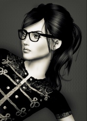
ELIZABETH: - Spoiler:
Nicolla: I think this is your worst shot to date. Its not bad but it isn’t good. You barely used your male model and he looks like a mannequin, its like you forgfot about him, put a bunch of clocks in the back, and were done. Eli looks constapated and her pose doesnt work with your male model, but i can say the edited jewelry is good but im just not sure you took this week too seriously. Its also the same look that you gave us week 1 and week 2, and i think you have to find a new expression, and thats going to be tough for you.
Elasticgirl: Beautiful model as always! I love the setting and the simplicity in it. I also love the clothes and think it is very high fashion. Now, I do think the pose is a little awkward. Your model does not look comfortable at all and Alan just looks kind of frozen and rigid. I don’t feel like the poses fit with the theme you are trying to portray. I think if you had the 2 models portray the hands on a clock then you would be creating a wickedly awesome photo! In addition, I really like your color chose but I think it would be much better if more things were in that color. Yes I understand you wanted to go subtle and not overdo it, but Elizabeth’s jewelry for example could be gold. Other than that, beautiful job—I wouldn’t say it is the best though because there are many ways that your model does not outshine Alan. For one, he is at a higher level than she is—instantly (even though he is wearing black and blends into the background) the viewer looks at him and that beautiful mask and beautiful jawline. And then my eyes travel down his body until, Oh! I spy Elizabeth leaning against him. I think if she were not leaning against him, it would look like she is more dominant and is not weak. In this photo, maybe if he leaned against her, Alan would be more “invisible” to the viewer and my eye wouldn’t catch him right away. In addition, I think the fact that his profile is the only thing visible creates a sense of mysteriousness and makes the viewer want to know, hey what’s behind this guy’s mask?
GLADICE: - Spoiler:
Nicolla: Gladice! This is such an improvemnt to what you've done! I really really like it! Gladice looks high fashion, Her expression is SO fierce, I do wish kales head was facing us but none the less, the sexual tenseness to this photo is great! I dont like the shirt, i wish you would try not drawing hair and just have a regular on Gladice, it might look nice, and if you do draw hair i recomend uysing the pen tool. The shirt could go, so could the streak, and i dont like the ribbon around her arm, it is improvement, but if you want to be up in the top your just going to have to be careful about what you add.
Elasticgirl: I think your model is stunning and I love the color you chose—it definitely pops. I also like the tattoos and I definitely think your model outshines. BUT there are some things I don’t like about this photo. For one, it’s not high fashion at all—at least to make it a tad high fashion you could’ve added a booty tooch. But no, there is no high fashion in this photo and it is definitely not a photo that would appear in any fashion magazine. In addition, Gladice’s eyes look a little freaky since they kind of glow white—I don’t like that. And also, I think you could’ve edited the magenta in better. For example the tattoo thing on the guy’s shoulder is not good at all. There is no dimension and I don’t think it at all fits. And I also noticed that on the hanger in the background, you “leaked” some of the magenta color from the shirt onto the hanger—na ah that’s not good!! The only other thing I do not like is that you do not see the male models face. IF you showed his face, it WOULD NOT make him look like he is not outshining. In this photo, with his head turned the other way, it looks like she could be going at it with a mannequin with a hair-covered pillow instead of a real guy. So although this photo is a huge improvement from your last shot it is still not my favorite.
ZARA: - Spoiler:
Nicolla: Im going start on a low, and there weere pretty much no highs. In the beginning i thought you were going to win this competition. I think your not putting that much of your heart into it. But if you are that’s why i am here to help. I really wish i could see Zara's eyes because now i cant judge her expression, the leaves suck in quality, it was very creative yes, but it looks like the picture fo a Edgar Poe book, or some poetry and it just doesnt give me 'model' at all. Im really dissapointed.
Elasticgirl: I am a little disappointed in you. I wouldn’t consider this your best shot at all. For one, your model has a beautiful face and since half of it is covered with a huge white hat, it does not help your model outshine the male model. If anything, since your male model and Zara are wearing matching colors and Zara is farther back in the photo, there is little to no outshining on her part. They are really equals in this photo. Another thing that bugs me a little is the path of leaves swirling around her. It is too overcrowded and in a way, it looks like her left leg is disappearing into the red leaves. I do not like that. So overall, your photo is lacking some high fashion and your model definitely does not outshine the male model.
DANA: - Spoiler:
Nicolla: Theres so much i love and theres one thing i just cant get past. Emmery's hair. Emmery is hot, and you turned him around. I was a bit annoyed because i think you got the best model, and it just doesn’t work. I hate the hair you gave Emmery and thats practically my only critisim besides, yoiu couldve used so much more Green. Also, The burning was WAY overboard instead of dodging, use overlay. I honestly like your photos for sftmnf more, because Odette looked NATURAL> I think dana is overdone with all the editing, and hair drawing, and I think if you just try using sim hair, it'll make Dana look so natural and gorgeous. The hair drawing is great but not all the time. Dana's pose is gorgeous, so is her expression, it was creative, and I think you are definitly improving!
Elasticgirl: Love it girl! Your model is gorgeous and that hair drawing is stupendous! I really like her pose and think it is very high fashion. I like the color you chose but I think you could’ve used that color so much more and to your advantage. I love your theme and definitely think you took it outside of the box. But I do not like the male model’s pose. Yes he is definitely outshined but he looks really awkward with his back to the camera. And by the way he is posed; he looks kinda fat and formless. Other than that, I really like this and think you did a great job (:
And now, the callout order: The First name I am going to call is: - Spoiler:
Dana! [You must be registered and logged in to see this image.]Congrats on winning first !
Runner-up for best photo of the week is: - Spoiler:
Justice! [You must be registered and logged in to see this image.]
The third name I am going to call is: - Spoiler:
Kea! [You must be registered and logged in to see this image.]
The fourth name I am going to call is: - Spoiler:
Elizabeth! [You must be registered and logged in to see this image.]
The fifth name I am going to call is: - Spoiler:
Gladice! [You must be registered and logged in to see this image.]
The sixth name I am going to call is: - Spoiler:
Imogen! [You must be registered and logged in to see this image.]
The seventh name I am going to call is: - Spoiler:
Charlie! [You must be registered and logged in to see this image.]
The eighth name I am going to call is: - Spoiler:
Zara! [You must be registered and logged in to see this image.]
The bottom two are : - Spoiler:
Bao and Jasmine Bao: [You must be registered and logged in to see this image.]Bao, I Nicolla, would just like to apologize to you a little bit, I scored you the hardest, and I feel a little bad. We do know you can deliver SO much more though! I love last week’s picture but this week is just a letdown. You’re gorgeous and our only Asian, which could give you the strength to go father, so we ask ourselves, does she have the strength to model, or does she just rely on what her momma and daddy gave her? Jasmine: [You must be registered and logged in to see this image.]Jasmine. We love you and your look. but you’re becoming pretty hard to keep up with, your scores are ever changing, and you have to be consistently at the top because we know your capable. Don't let us down because we believe in you Jasmine. We ask ourselves-yes pretty face, capable of much, but can she consistently deliver, or will she soon fall to the bottom of the pack as she had already reached her peek.
So who stays in this competition? - Spoiler:
We believe that you can pull it together…
- Spoiler:
And that you, also can pull it together…
- Spoiler:
4 drop outs once again saved you ladies…
- Spoiler:
Because no one is going home today, we decided, you've both put together some GREAT pieces of work, and it would be hard to eliminate one of you. Congratulations. You both are saved from elimination and through to the next round.
Overall Ranking: - Spoiler:
1. ELIZABETH: 374
2. JUSTICE: 373
3. KEA: 356
4. DANA: 345.5
5. JASMINE: 340
6. BAO: 321.5
7. IMOGEN: 306
8. GLADICE: 303.5
9. ZARA: 299.5
10. CHARLIE: 297
Last edited by Elasticgirl on Sat Sep 15, 2012 1:38 pm; edited 15 times in total | |
| | | | Elasticgirl
Admin
Posts : 533
Points : 345579
Reputation : 4
Join date : 2012-07-20
Age : 27
Location : Over the rainbow
| | Subject: Re: [RESULTS UP!!] ASSIGNMENT 3 ~ Outshine!~ Tue Aug 28, 2012 9:46 am | |
| | |
| | | | Elasticgirl
Admin
Posts : 533
Points : 345579
Reputation : 4
Join date : 2012-07-20
Age : 27
Location : Over the rainbow
| | Subject: Re: [RESULTS UP!!] ASSIGNMENT 3 ~ Outshine!~ Tue Aug 28, 2012 9:46 am | |
| | |
| | | | Elasticgirl
Admin
Posts : 533
Points : 345579
Reputation : 4
Join date : 2012-07-20
Age : 27
Location : Over the rainbow
| | Subject: Re: [RESULTS UP!!] ASSIGNMENT 3 ~ Outshine!~ Tue Aug 28, 2012 9:46 am | |
| | |
| | | | DiorSim
Posts : 193
Points : 342626
Reputation : 0
Join date : 2012-08-08
Location : Germany
| | Subject: Re: [RESULTS UP!!] ASSIGNMENT 3 ~ Outshine!~ Tue Aug 28, 2012 9:57 am | |
| Interesting  | |
| | | | Voïces

Posts : 91
Points : 342789
Reputation : 0
Join date : 2012-07-31
| | Subject: Re: [RESULTS UP!!] ASSIGNMENT 3 ~ Outshine!~ Tue Aug 28, 2012 10:27 am | |
| You always keep a part of secret, of suspens! That's why I love this contest. Can't wait to see what you mean about "Outshine"
Last edited by Voïces on Tue Aug 28, 2012 11:25 am; edited 1 time in total | |
| | | | Designful991

Posts : 88
Points : 342195
Reputation : 0
Join date : 2012-08-07
| | Subject: Re: [RESULTS UP!!] ASSIGNMENT 3 ~ Outshine!~ Tue Aug 28, 2012 10:29 am | |
| Can't wait to know more about this )) | |
| | | | Elasticgirl
Admin
Posts : 533
Points : 345579
Reputation : 4
Join date : 2012-07-20
Age : 27
Location : Over the rainbow
| | Subject: Re: [RESULTS UP!!] ASSIGNMENT 3 ~ Outshine!~ Tue Aug 28, 2012 10:31 am | |
| Hehehe yup I definitely try to keep this comp as suspenseful and exciting as possible. Sorry you guys have to wait to find out what outshining even means in this comp!! | |
| | | | Bubbles1419

Posts : 174
Points : 342417
Reputation : 0
Join date : 2012-08-09
Age : 25
| | Subject: Re: [RESULTS UP!!] ASSIGNMENT 3 ~ Outshine!~ Tue Aug 28, 2012 11:54 am | |
| There are so many things that could fit with the title! Ooooo suspense galore! | |
| | | | Elasticgirl
Admin
Posts : 533
Points : 345579
Reputation : 4
Join date : 2012-07-20
Age : 27
Location : Over the rainbow
| | Subject: Re: [RESULTS UP!!] ASSIGNMENT 3 ~ Outshine!~ Tue Aug 28, 2012 11:56 am | |
| | |
| | | | Ezparis

Posts : 26
Points : 341544
Reputation : 0
Join date : 2012-08-12
| | Subject: Re: [RESULTS UP!!] ASSIGNMENT 3 ~ Outshine!~ Tue Aug 28, 2012 12:25 pm | |
| This is really interesting!
Also is round 2 still elimination seeming as someone dropped? | |
| | | | Elasticgirl
Admin
Posts : 533
Points : 345579
Reputation : 4
Join date : 2012-07-20
Age : 27
Location : Over the rainbow
| | Subject: Re: [RESULTS UP!!] ASSIGNMENT 3 ~ Outshine!~ Tue Aug 28, 2012 12:28 pm | |
| Yup assignment 2 is still elimination. One of our surprises for that assignment was going to be a double elimination but since someone dropped, only on will be eliminated. | |
| | | | Mad87

Posts : 41
Points : 341690
Reputation : 0
Join date : 2012-08-11
Age : 37
| | Subject: Re: [RESULTS UP!!] ASSIGNMENT 3 ~ Outshine!~ Tue Aug 28, 2012 12:39 pm | |
| Hum... I wonder what it will be... Another surprise oh that kind in assignment 3 ?  | |
| | | | Elasticgirl
Admin
Posts : 533
Points : 345579
Reputation : 4
Join date : 2012-07-20
Age : 27
Location : Over the rainbow
| | Subject: Re: [RESULTS UP!!] ASSIGNMENT 3 ~ Outshine!~ Tue Aug 28, 2012 12:42 pm | |
| Hmmm all I will say is it is abstract, requires a lot of creativity, and more than one focus in a high fashion atmosphere... | |
| | | | alexssims

Posts : 14
Points : 341576
Reputation : 0
Join date : 2012-08-11
| | Subject: Re: [RESULTS UP!!] ASSIGNMENT 3 ~ Outshine!~ Tue Aug 28, 2012 6:09 pm | |
| | |
| | | | GlamSIMorous

Posts : 67
Points : 342065
Reputation : 0
Join date : 2012-08-08
| | Subject: Re: [RESULTS UP!!] ASSIGNMENT 3 ~ Outshine!~ Thu Aug 30, 2012 6:26 am | |
| This sounds so .... Holy Mama ! I am really excited for this. | |
| | | | Elasticgirl
Admin
Posts : 533
Points : 345579
Reputation : 4
Join date : 2012-07-20
Age : 27
Location : Over the rainbow
| | Subject: Re: [RESULTS UP!!] ASSIGNMENT 3 ~ Outshine!~ Thu Aug 30, 2012 9:08 am | |
|  I'm glad you guys are excited but I'm really sorry you now have to wait until Sunday or Monday XD | |
| | | | Voïces
Posts : 91
Points : 342789
Reputation : 0
Join date : 2012-07-31
| | Subject: Re: [RESULTS UP!!] ASSIGNMENT 3 ~ Outshine!~ Thu Aug 30, 2012 9:18 am | |
| It's OK Elas, no problem | |
| | | | Elasticgirl
Admin
Posts : 533
Points : 345579
Reputation : 4
Join date : 2012-07-20
Age : 27
Location : Over the rainbow
| | Subject: Re: [RESULTS UP!!] ASSIGNMENT 3 ~ Outshine!~ Mon Sep 03, 2012 11:06 am | |
| ASSIGNMENT 3 IS UP!
GOOD LUCK EVERYONE! | |
| | | | Isisaur

Posts : 17
Points : 341667
Reputation : 0
Join date : 2012-08-10
Age : 44
Location : France
| | Subject: Re: [RESULTS UP!!] ASSIGNMENT 3 ~ Outshine!~ Mon Sep 03, 2012 11:28 am | |
| Oh, Angelo is...   . Bao is very, very happy ! | |
| | | | Elasticgirl
Admin
Posts : 533
Points : 345579
Reputation : 4
Join date : 2012-07-20
Age : 27
Location : Over the rainbow
| | Subject: Re: [RESULTS UP!!] ASSIGNMENT 3 ~ Outshine!~ Mon Sep 03, 2012 11:35 am | |
| Hehehe I am glad you like Isisaur and I am glad Bao is very VERY happy | |
| | | | Voïces
Posts : 91
Points : 342789
Reputation : 0
Join date : 2012-07-31
| | Subject: Re: [RESULTS UP!!] ASSIGNMENT 3 ~ Outshine!~ Mon Sep 03, 2012 11:53 am | |
| Nice, really nice! Really good idea! And I love Tod, light skin like Charlie So, we can change eye, haircut, clothes... but also beard and eyebrows? Thank you for being so imaginative judges. | |
| | | | Elasticgirl
Admin
Posts : 533
Points : 345579
Reputation : 4
Join date : 2012-07-20
Age : 27
Location : Over the rainbow
| | Subject: Re: [RESULTS UP!!] ASSIGNMENT 3 ~ Outshine!~ Mon Sep 03, 2012 11:56 am | |
| Glad to hear! Yes, you can change all those things as long as the hair color and the eye color stick to the original colors. You may add a beard also but I would prefer if you didn't change the eyebrows. You still can but I wouldn't really reccomend it | |
| | | | Elasticgirl
Admin
Posts : 533
Points : 345579
Reputation : 4
Join date : 2012-07-20
Age : 27
Location : Over the rainbow
| | Subject: Re: [RESULTS UP!!] ASSIGNMENT 3 ~ Outshine!~ Mon Sep 03, 2012 12:14 pm | |
| I am so sorry to see you go, Alex. We really enjoyed having you here and I am disappointed to see you go, but RL comes first. Thank you for being totally honest with us and we hope to see you around more... | |
| | | | GlamSIMorous
Posts : 67
Points : 342065
Reputation : 0
Join date : 2012-08-08
| | Subject: Re: [RESULTS UP!!] ASSIGNMENT 3 ~ Outshine!~ Mon Sep 03, 2012 12:29 pm | |
| I wanna tell you guys that I need extension. Cuz I am back in school since todays morning and I have 4 lessons that are 10 hours long. I just cant really be that fast even if I try to okay ? So maybe Ill be finished by time or maybe not - just wanna make that straight Not that you wonder. (And this time I wanna give a major job!) | |
| | | | Sponsored content
| | Subject: Re: [RESULTS UP!!] ASSIGNMENT 3 ~ Outshine!~ | |
| |
| | | | | | [RESULTS UP!!] ASSIGNMENT 3 ~ Outshine!~ | |
|
Similar topics | |
|
| | Permissions in this forum: | You cannot reply to topics in this forum
| |
| |
| | Who is online? | In total there is 1 user online :: 0 Registered, 0 Hidden and 1 Guest None Most users ever online was 210 on Sun Jul 04, 2021 1:25 pm |
| Statistics | We have 86 registered users
The newest registered user is harrande
Our users have posted a total of 1954 messages in 71 subjects
|
|
